
BRAND IDENTITY | LOGO DESIGN | CALLIGRAPHY | STATIONERY
Inspired by the Italian spirit, Berloti creates an atmosphere where elegance mixes perfectly with the joy of dining with your friends or family.
While also appealing for business meetings, the restaurant's main clients are in their 30s and seek to relax, giving the restaurant a younger and more modern atmosphere.
The great selection of wines is one of the key elements of the restaurant, alongside the Mediterranean-focused menu.

―
One of the challenges when working on the Logo was to showcase the elegance of the restaurant without making it feel too sober.
In the initial sketches, I tried three main styles:
1) I started with a simpler, sans-serif style for the name, where a more classic handwriting "Ristorante" brings the elegance.
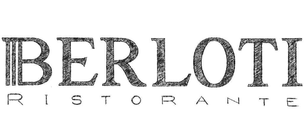
2) Second, a serif and sans-serif combination of fonts. Here, I tried to bring the Italian vibe by incorporating a column shape in the "B". The minimal "Ristorante" contrasts with the classic "Berloti", enhancing one another.
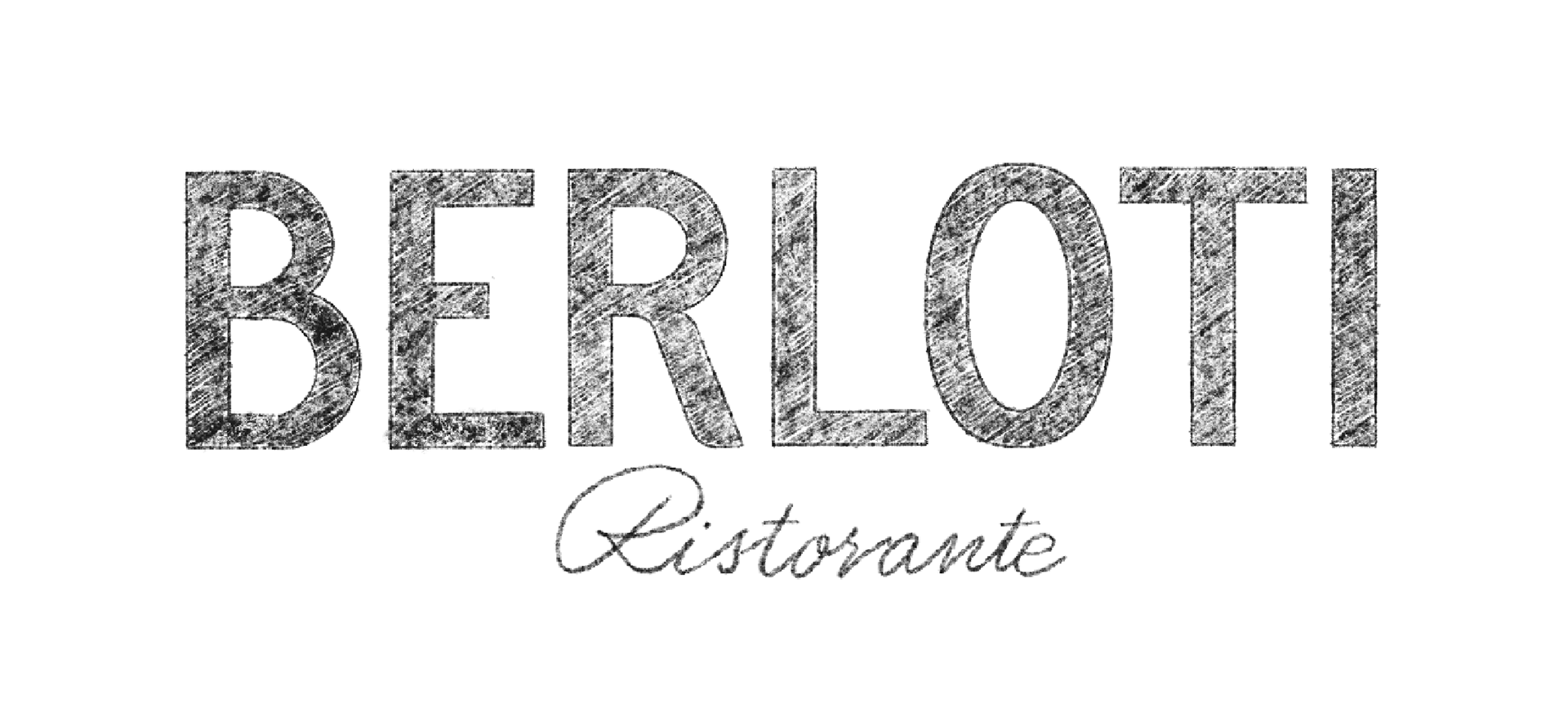
3) The third approach was a calligraphic style for the name, alongside a sans-serif for the "Ristorante". The idea of hand lettering appealed the most to the client, since it is not as common as the first two. It also manages to bring a classic feel, without being too heavy and sober.
After exploring different styles of calligraphy, the final logo took shape. The last step was sending the sketch to Illustrator, in order to create the vector file that will be sent to the client.
