BRAND IDENTITY | LOGO DESIGN | LETTERING | ILLUSTRATIONS | STATIONERY | PACKAGING DESIGN
THE CLIENT
The story of Friedrich Schmidt begins at the age of 15, when he left his hometown of Frankfurt, Germany, and embarked on a new life in the vibrant city of New York, USA. It was there that his love for coffee flourished. Now, at 33, he has turned that passion into a reality by opening a Café Shop in the very city that became his second home. Each cup served tells the tale of his journey—a journey of tradition, discovery, and the pursuit of excellence. This café is not just a place to enjoy exceptional coffee; it's a reflection of a life reinvented, an homage to both his German roots and the new chapter he began in New York.

DESIGN APPROACH
Discussing the brief, challenges, solutions and design process
―
THE PROBLEM
Create a brand identity that is modern and appeals to the American customers, while also invoke the German roots of its owner.
Prefer an elegant touch, for the middle-upper class.
Include the color black, without looking sober.
THE SOLUTION
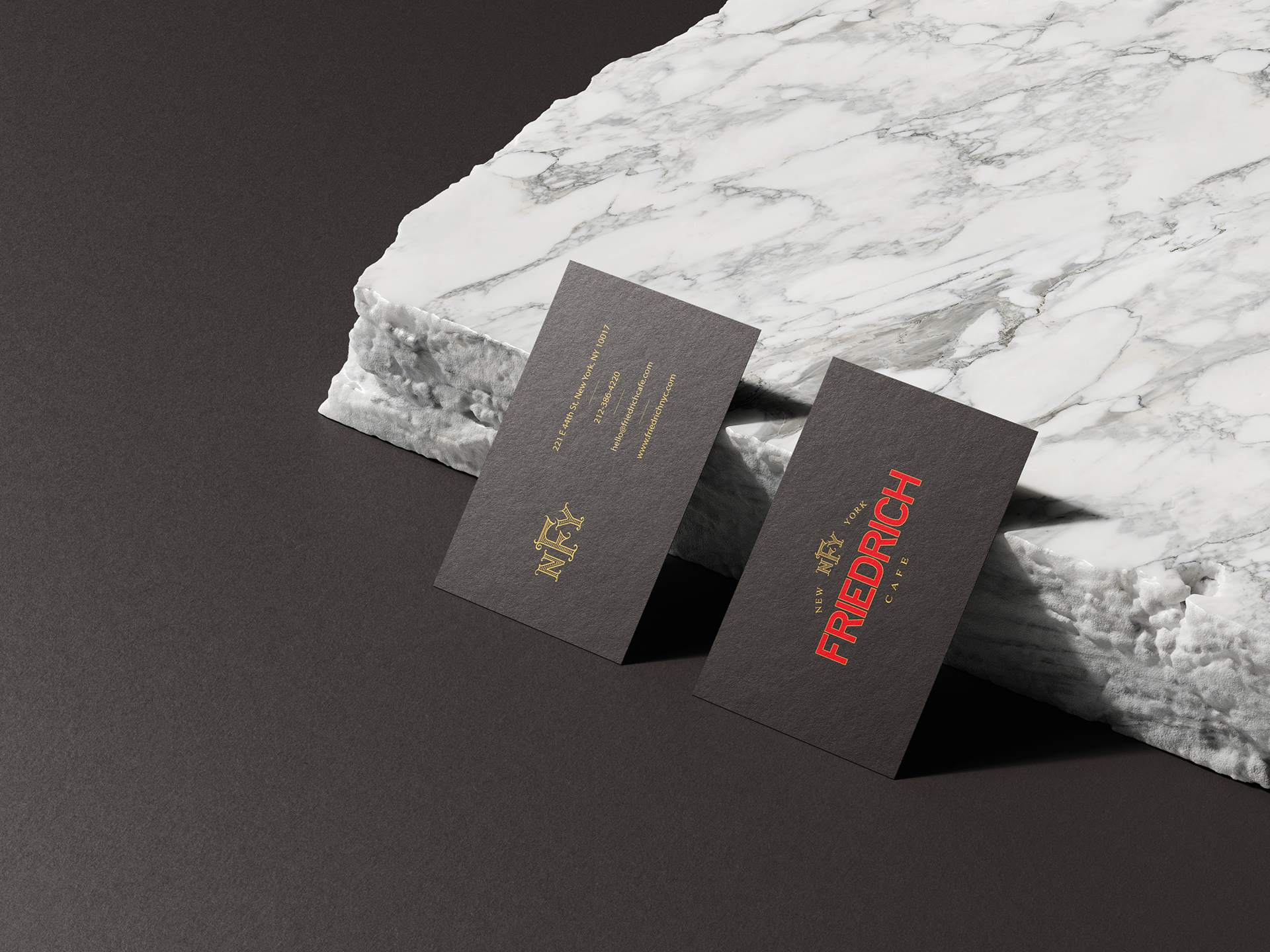
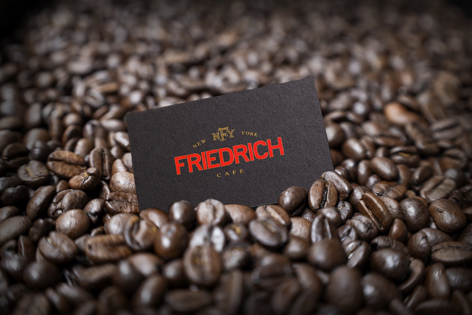
I've created a Sans serif font, for the modern and minimalist feel, to target the American audience. Elegance is also present through the serif used for "Cafe" and "New York".
For the monogram, the well-known gothic fonts would have make it stereotypical and too sober. Instead, we decided on creating a serif that would also look elegant. The horizontal lines give the Logo a fresh look and make it stand out.
To invoke the German roots, while also include black alongside another color, we used the German flag as inspiration. Thus, black, red and yellow are present throughout the brand's image, creating a color palette with a deep meaning.
TWO CULTURES, ONE DESIGN
Friedrich Cafe is about mixing tradition with modernity, it's about a merge that brings the best out of two worlds.
Its design had to show it
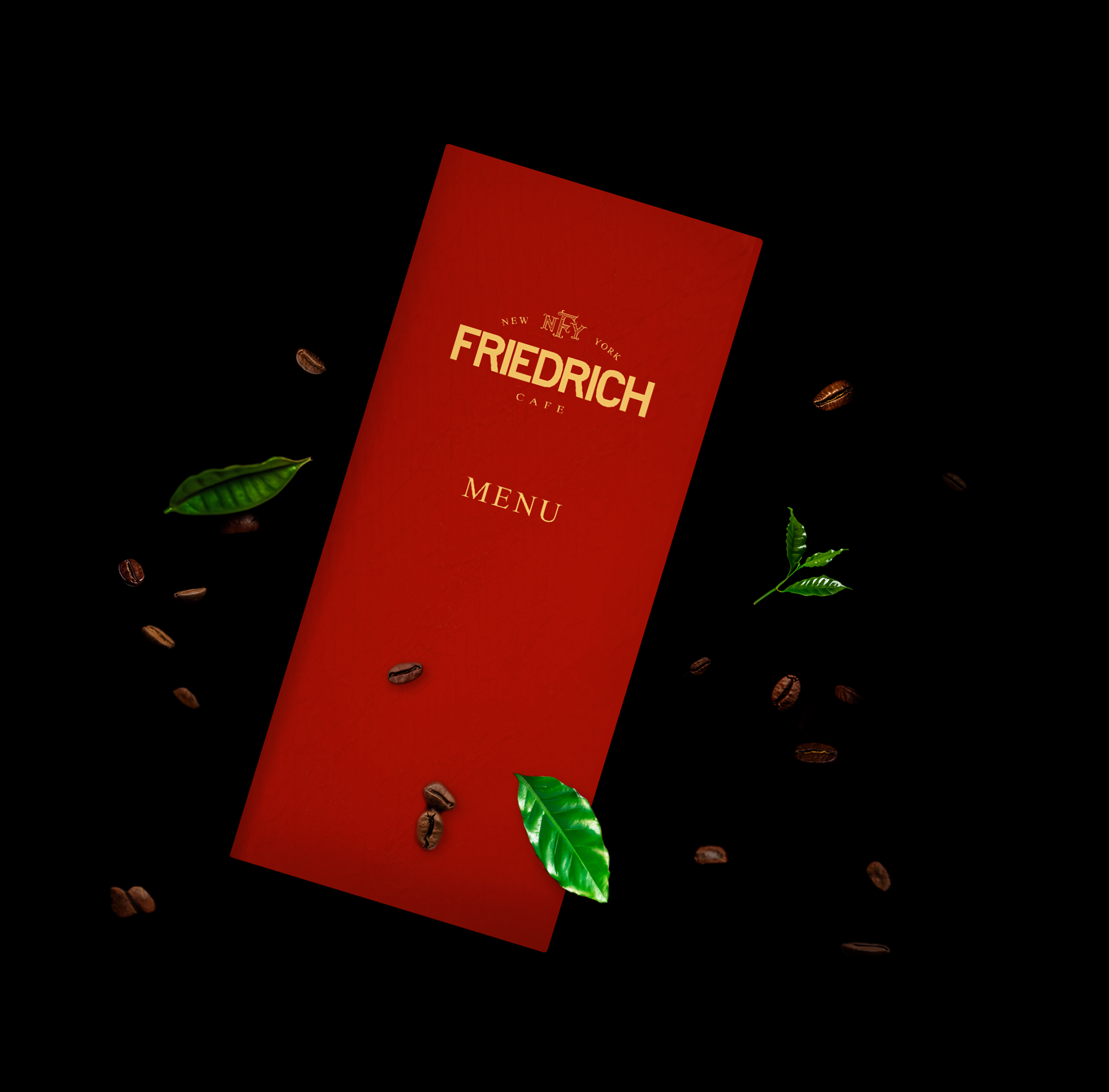
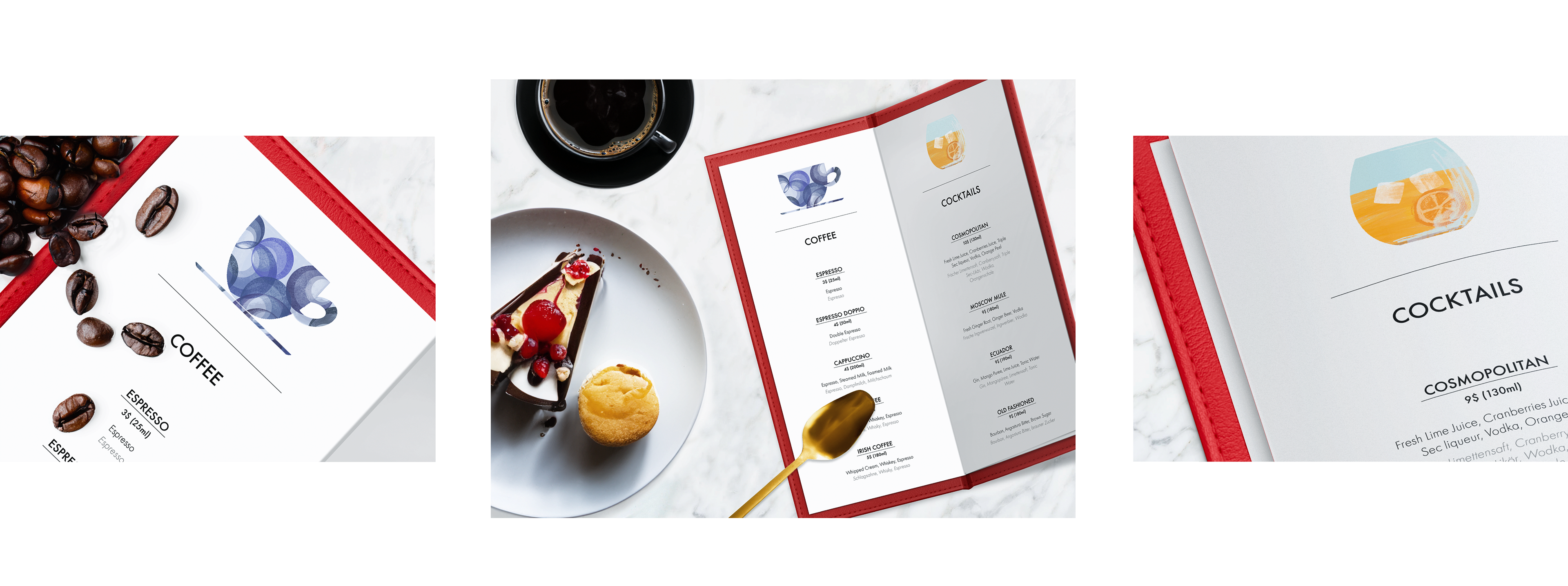
A NOBLE RED
We selected a rich, vibrant red to adorn the menu, perfectly capturing the sophisticated essence of our Café Shop's refined taste. The striking snake skin texture serves as a defining feature of the design, lending the menu an air of exclusivity and timeless elegance. Its sleek, elongated shape offers both elegance and ease of handling, creating a truly distinctive presence. The bold yellow logo contrasts exquisitely, enhancing the overall aesthetic with its unique, standout quality. The luxurious leather further elevates the ambiance, embodying the premium experience it aims to deliver.
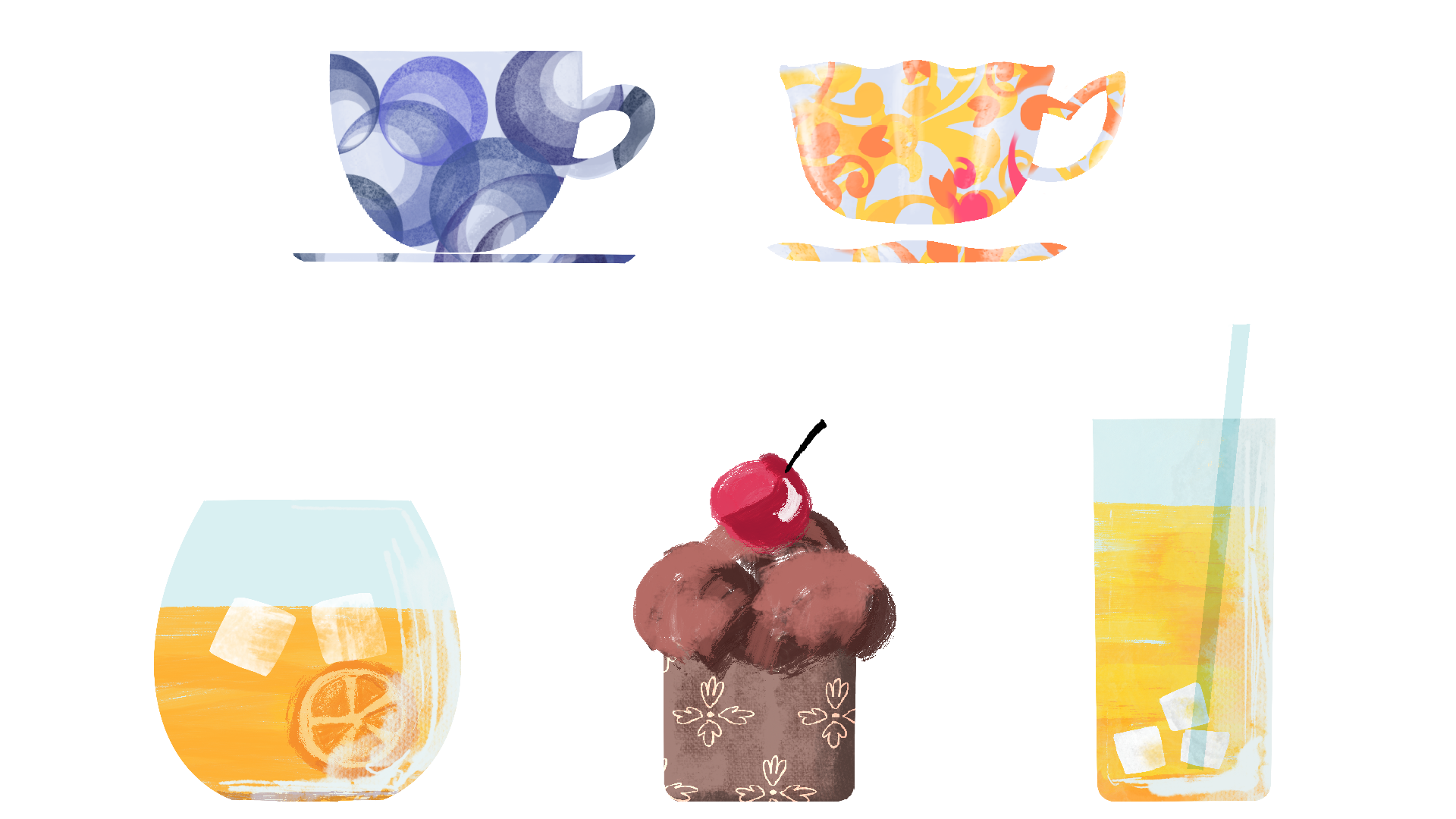
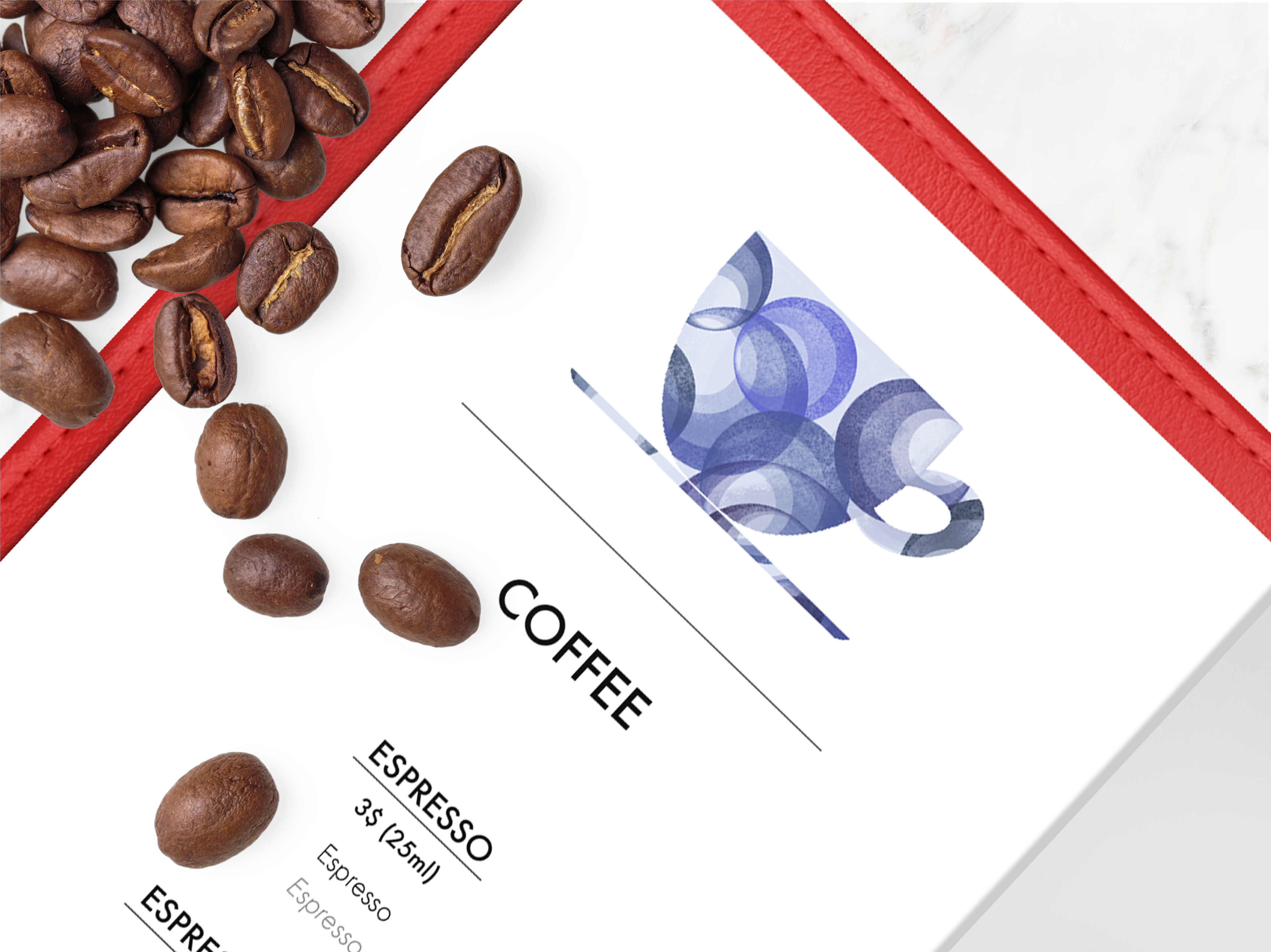
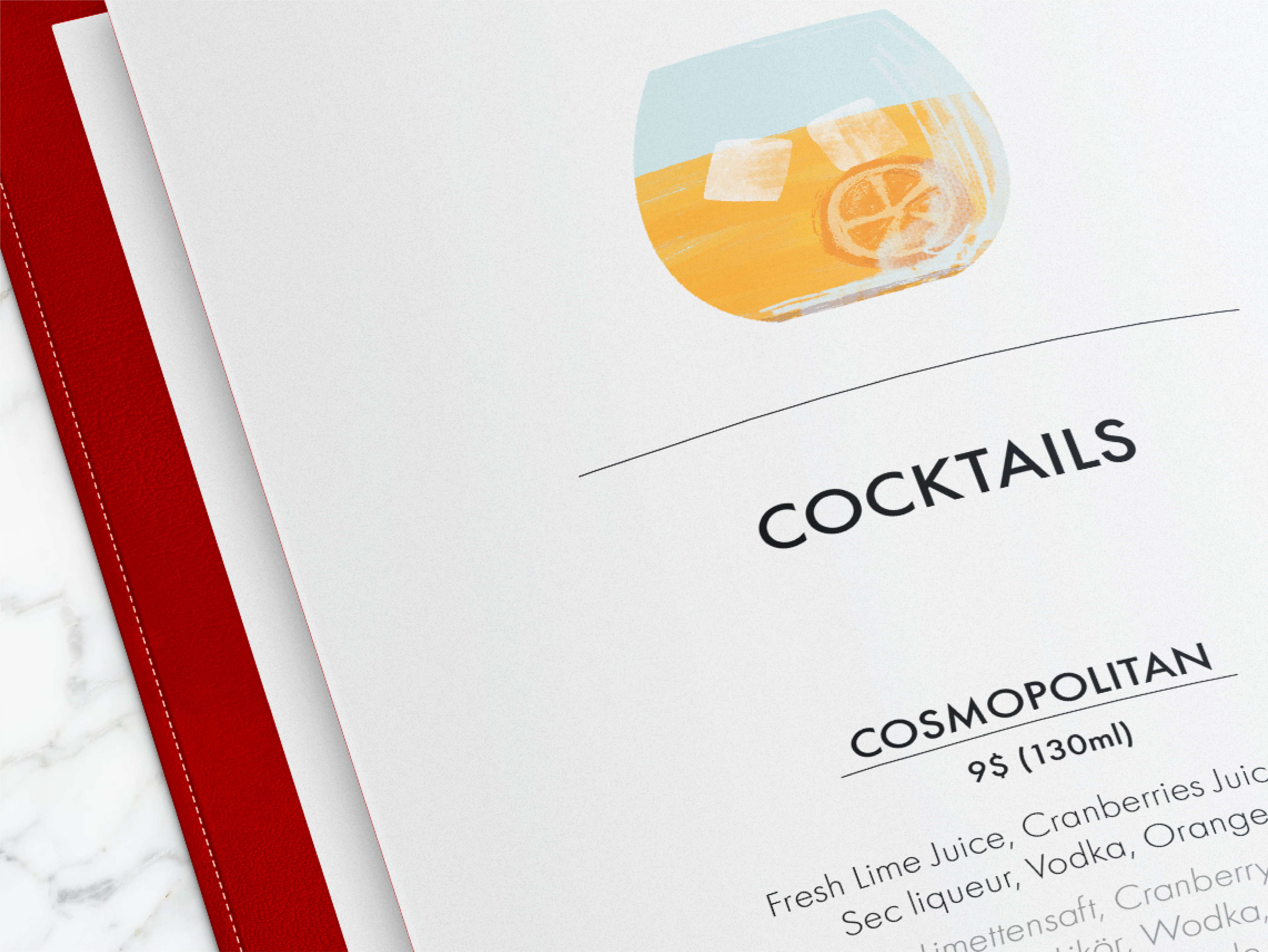
A DESIGN OF REFINED TASTE
The menu is beautifully designed with icons, all of which I personally crafted, placed at the top of each page to represent their respective categories. The artwork is an exquisite display of vibrant colors, designed with an innate sense of taste and luxury. Each icon is meticulously rendered to evoke an air of refined elegance, capturing the essence of sophistication and class. Every brushstroke is thoughtfully executed, ensuring a harmonious balance of rich hues and timeless style, while elevating the overall visual experience to one of undeniable opulence.
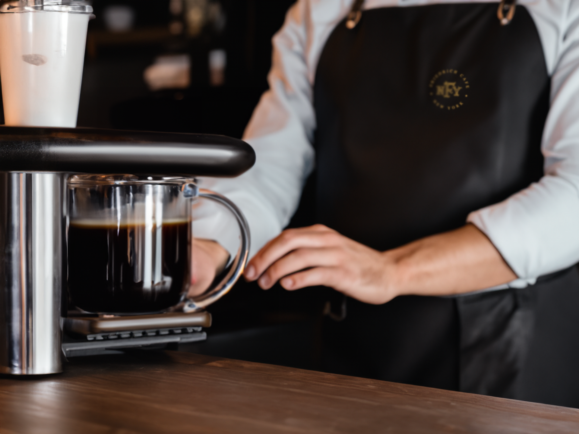
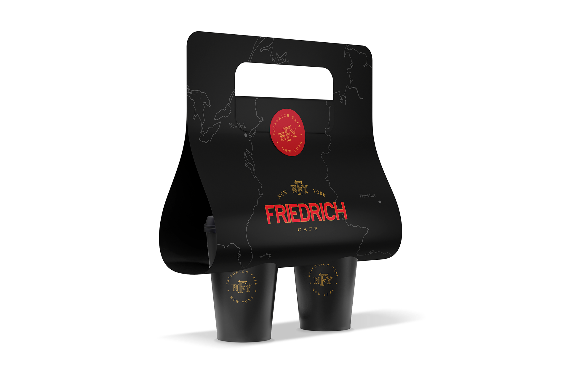
A JOURNEY IN EVERY SIP:
THE COFFEE-TO-GO PACKAGING DESIGN
The coffee-to-go packaging features an elegant, sleek black design with a minimalist approach. The contour of both the USA and Germany is subtly integrated, each highlighting New York and Frankfurt — symbols of the owner's journey. Friedrich, originally from Frankfurt, moved to New York, and this thoughtful design pays homage to both cities.
I've designed a set of icons to represent the main categories of food and drinks.