Located at the 20th floor, “Upstairs” is a luxury lounge where you enjoy not only your meal, but also the beauty of the city as seen from above.
The rooftop has some of the best chefs in town and aims to attract people who search for high end dining in an ellegant yet friendly ambience.
LOGO CREATION
―
The Logo was created taking in mind many aspects:
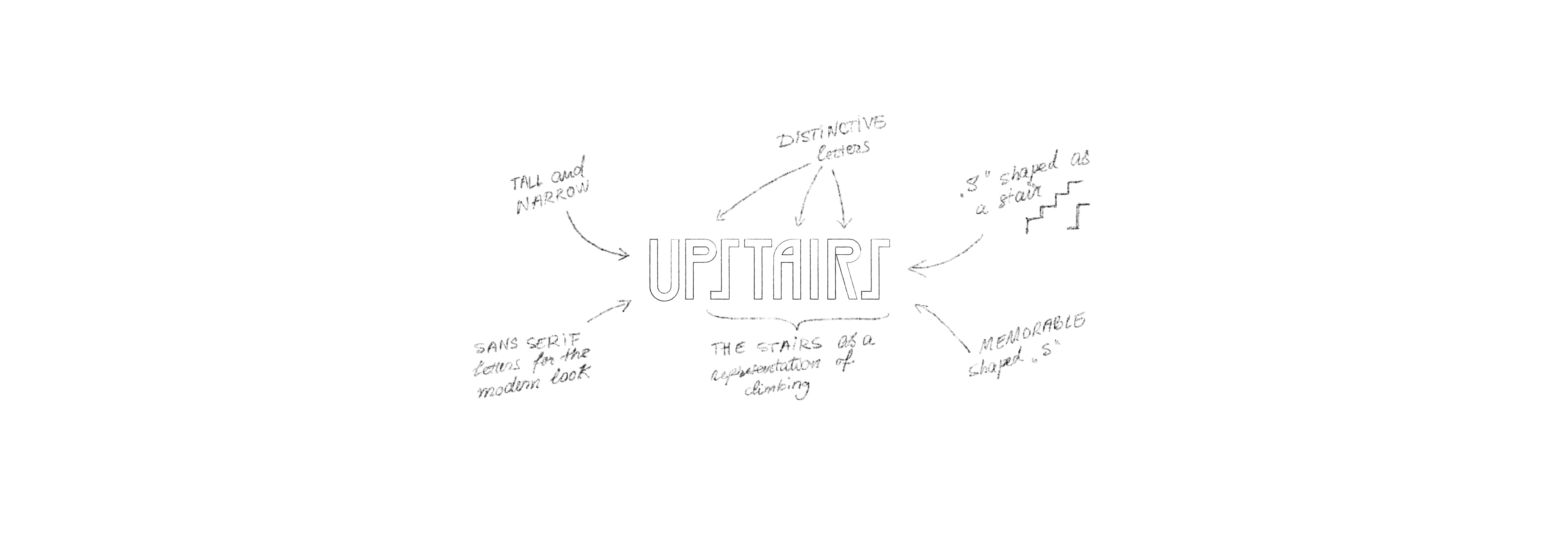
First, we had to put accent on the idea of “rooftop”. One of the key elements while dining here is the beautiful view you have on the city. In order to bring this idea to life, I made a tall and narrow font, to create the perception of height. This way, the customer has, from the first moment he sets his eyes on the logo, the feeling that he is dining “upstairs”.
Another important aspect when creating the font was the idea of an iconic “shape”. And the best way to show it was by focusing on the name’s meaning: (up)STAIRS. This way, I decided to made the letters "S" as an abstract representation of stairs. The idea of height, of stairs as a representation of climbing, was the perfect match.
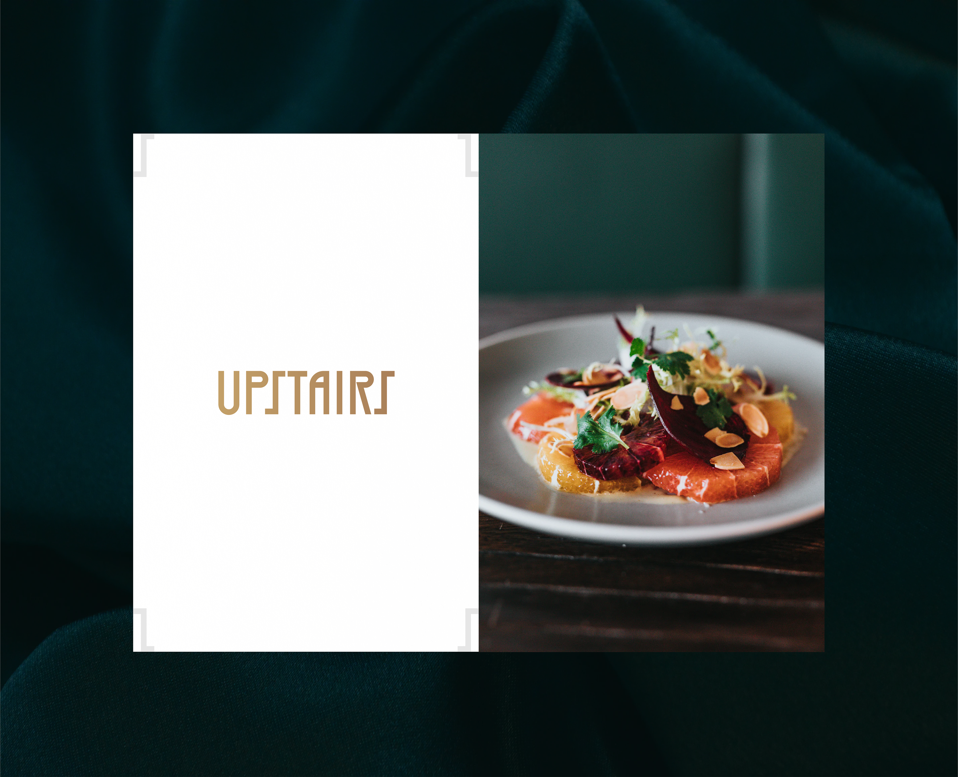
In the end, we had to make sure we keep a modern feel while adding a touch of classic. For this, I went with a sans serif style for the modern feel, with letters that manage to stand out due to their height and uncommon lines. At the same time, the classic touch is present through the luxurious gold combined with a deep, serious green.